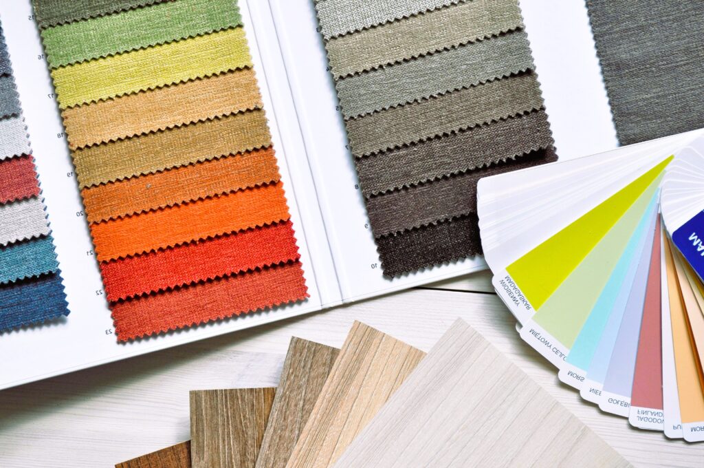
Color is one of the most powerful tools in interior design, capable of evoking emotions, influencing mood, and shaping the perception of a space. From calming blues to vibrant reds, the choice of color palette can have a profound impact on the atmosphere and ambiance of a room. In this article, we’ll explore the fascinating world of color psychology in interior design and how you can use it to create spaces that are not only visually appealing but also emotionally resonant.
Understanding Color Psychology
Color psychology is the study of how colors affect human behavior, emotions, and perceptions. Different colors have been shown to evoke specific psychological responses, with each hue carrying its own symbolic meaning and cultural associations. By understanding the psychological effects of color, interior designers can strategically use color to create environments that promote well-being, productivity, and comfort.
Key Principles of Color Psychology in Interior Design
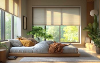
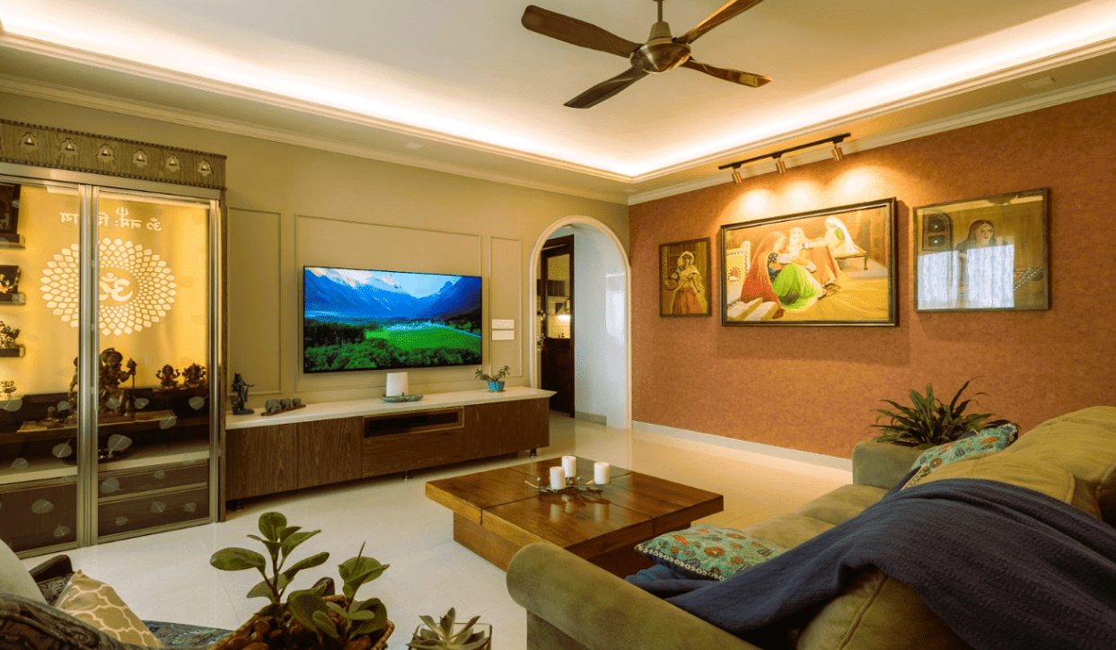
- Warm vs. Cool Colors: Warm colors such as reds, oranges, and yellows are known to evoke feelings of warmth, energy, and excitement. These colors are often used in areas where socialization and activity are encouraged, such as living rooms and dining areas. Cool colors such as blues, greens, and purples, on the other hand, are associated with calmness, serenity, and relaxation. These colors are often used in bedrooms, bathrooms, and other spaces where rest and rejuvenation are prioritized.
- Color Associations: Different colors are often associated with specific emotions or qualities. For example, blue is often associated with trust, stability, and tranquility, making it an excellent choice for office spaces or areas where concentration and focus are required. Green is associated with nature, growth, and harmony, making it a popular choice for spaces designed to promote health and well-being, such as yoga studios or meditation rooms.
- Contrast and Balance: In interior design, the use of contrast and balance is crucial for creating visually appealing spaces. Contrast refers to the difference between light and dark colors, while balance refers to the distribution of color throughout a room. By strategically incorporating contrast and balance into your color scheme, you can create depth, visual interest, and harmony within a space.
- Personal Preference: It’s important to remember that individual responses to color can vary based on personal preference, cultural background, and past experiences. While certain colors may have universal associations, others may evoke different emotions or reactions depending on the individual. When designing a space, consider the preferences and sensitivities of the people who will be using it to ensure a positive and comfortable experience for all.
Practical Tips for Using Color in Interior Design
- Start with a Neutral Base: When designing a room, start with a neutral base of whites, grays, or beiges, and layer in color through accents such as furniture, artwork, and accessories. This allows you to easily change or update the color scheme over time without making major changes to the space. Did you like our article? Read also about Luxurious life.
- Consider the Function of the Space: Think about the intended function of the space and choose colors that support that function. For example, if you’re designing a home office, consider using calming blues or greens to promote focus and productivity. If you’re designing a dining room, consider using warm tones such as reds or oranges to stimulate appetite and conversation.
- Experiment with Different Shades and Tones: Don’t be afraid to experiment with different shades and tones of color to find the perfect balance for your space. Consider using lighter shades for small rooms to create a sense of openness and airiness, and darker shades for larger rooms to add drama and coziness.
- Use Color to Highlight Architectural Features: Use color strategically to highlight architectural features such as moldings, trim, or built-in shelving. Consider using a contrasting color to draw attention to these elements and create visual interest within the space.
- Consider the Lighting: Keep in mind that lighting can greatly affect the way colors appear in a space. Natural light can enhance the vibrancy of colors, while artificial light can alter their hue and intensity. Consider the orientation of windows and the type of lighting fixtures used when choosing colors for your space.
Resources for Color Psychology Standards
For further information and inspiration on color psychology in interior design, consider consulting reputable sources such as Wikipedia’s article on Color Psychology. These resources offer valuable insights into the principles of color psychology and can help guide you in creating spaces that are not only visually stunning but also emotionally resonant.
In conclusion, color psychology is a powerful tool in interior design, capable of influencing mood, behavior, and perception. By understanding the psychological effects of color and using it strategically in your design process, you can create spaces that are not only visually appealing but also conducive to well-being and comfort. Whether you’re designing a cozy bedroom retreat or a vibrant social space, harnessing the power of color psychology can help you create environments that uplift, inspire, and delight all who inhabit them.